The Drag-And-Drop Future Of Developing For Voice

In the era of Wix, Squarespace and GoDaddy, it can be hard to remember that once upon a time building a quality website was a real pain.
Even the pros struggled.
Today, Amazon is about the slickest marketplace on the web by a variety of measures. However, in 1995, when it first launched, it looked like this:

And please, don’t think we’re singling out Amazon for design derision, because the truth is that in the late ‘90s and early 2000s, most of the internet actually looked pretty bad.

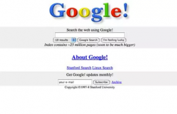
Google in 1996, for example, liked the same color palette they do now but hadn’t figured out the magic of the doodle yet.
Admit it — until right now you forgot about that exclamation point, and now that you’ve seen it again, you kind of miss it.
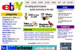
And then there’s the “gold standard” in ugly late ‘90s web design: the original site for eBay.
Originally hailed as the site that “did everything wrong” design-wise, eBay’s original, brightly colored — verging on eyeball-searing — banner ad-choked design had the unlikely effect of engendering something like affection among its users. It was a design so memorably bad people actually loved it.
it.
Please remember, these images were the work of not just the pros, but arguably the most professional of the pros — as these are the brands that did well enough back in the day to survive the dot.com crash in 2000 and grow up to dominate the web. Small mom-and-pop businesses and web users thought they were hot stuff if their sites had cutting-edge features such as pictures and colors.
Many reasons — many hardware-related — contributed to the series of eyesores that made up the early days of internet design. But a lot of the trouble was just proficiency. Twenty years ago, a good website was hard to build because one had to know a lot about HTML coding to even begin to build a mediocre website. As coding was still a comparatively rare skill set at the dawn of the digital era, good websites — even functional ones — were hard to find.
Flash forward 20 years and anyone with a few hundred dollars to spend and a free weekend can build a reasonably slick-looking website using the wide universe of software applications and web templates that make site construction drag and drop so easy.
But building a skill for a smart speaker platform like Alexa? Well, that’s still quite foreign for a majority of people. Alexa has a little over 25,000 skills to call its own, but the vast majority of firms have — as of yet — not built a skill for the emerging platform.
That’s a problem the Belarusian developers who went on to found Storyline — Vasili Shynkarenka (CEO) and Maksim Abramchuk (CTO) — wanted to fix. Having built chat-based applications for chatbots (think Facebook Messenger) and voice apps, they began to recognize the programming friction currently associated with the creation of said voice applications.
“We realized there was this big struggle with creating conversational apps,” Shynkarenka said. “We learned that creative people and content creators are not really good at writing code. That was the major insight.”
The obvious solution was to take the technical side off the table to make it easier to build things.
And so, Storyline was born.
Drag, Drop and Go
Storyline’s premise is simple, according to its founders: They offer an easy user interface that allows customers a simple “drag-and-drop” method of building an Amazon skill — no special coding required and straightforward enough that a simple skill can be built in under 10 minutes.
To use the free version of the service, users create an account and fill in some data on what exactly they’re looking to build before being taken into the template lab part of the service that lets users customize the app’s conversational flow. The builder starts, for example, with the skill’s greeting and then works through a series of text blocks that Storyline visually logs in overview form concurrent to the building process. Editing allows the builder to customize what kinds of questions the skill can ask, what types of responses it can accept and how Alexa is to reply.
Users can even configure for when a consumer does or says something “unexpected.”
A skill can be tested through a series of demo interactions and then deployed on Amazon. Customers must have an Amazon Developer account to publish their skills. If users lack said account? No problem. Storyline is also programmed to take a user through skill creation.
Most Likely Users
The skill creation tool today, most reviewers and even the firm’s founders agree, is best suited for somewhat simple and straightforward skills with fairly predictable interactions between a user and the artificial intelligence.
But, Shynkarenka noted, that is changing, as Storyline is signing up an increasing number of users of all kinds. Since launching in the fall, over 4,000 people have signed up for an account and have created roughly the same number of skills. To date, about 200 of those have gone live on Amazon’s Skill Store.
“The uses and the users are getting more sophisticated in even these early days,” he said.